본문
CI
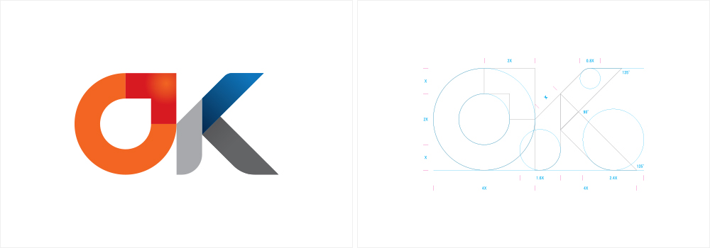
The arrow that extends from the earth to the northeast, expressed as an image of oil droplets, reflects the role of Oilhub Korea as a <Cradle of oil hubs in Northeast Asia>, and the shape of the bird to spread its wings to soar reflects our strong commitment to become a global company.
The enthusiastic figure of the company that manages the energy is expressed through Red, and the image of the company that is loved and trusted by the people is expressed through Blue and Grey color. The initials of Oilhub Korea, the symbol marks O and K, are the symbol of Oilhub Korea's company spirit to become a company that enables customers to be OK (Satisfied).
Symbol Mark

Korean ver.

English ver.

